August 15, 2008

Transparency Tool

I just had a request to learn how to do transparencies or make an element or paper lighter (more see through). After you do this you can stack two or three papers on top of each to make one paper (save it in jpeg format) and give elements new use on your LO's. It is pretty easy, but also a LOT of fun to play with the possibilities. Below is the one I use most, the "even" transparency, but there is also gradual and brush that you can get to know.


1. I just picked an element and paper for this exercise. (From my Counting Sheep kit). Select the item you want to make transparent. Here it is the sheep.
2. Then at the top of your tool bar select Effects, scroll down and highlight "Transparency" then select "Even". (Click on screen shot to enlarge if you need)
3. Move the bar back and forth to increase or decrease transparency. Have fun with this!

June 17, 2008

Using Elements

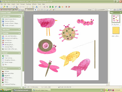
Often times we buy kits with a few elements on a page, like "My Big Backyard Girl" kit elements come. I know other programs are different and you use a lasso tool or technique to get individual elements off the page, but in DIP this is one way you can do it:

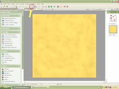
1. Open the element page you want to use and also the paper you are "pasting" on.
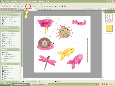
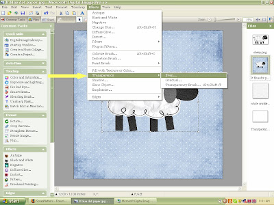
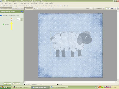
2. There are two tools you can use. The first is the marquee tool located in the lower tool bar.

3. After you have clicked on the marquee tool you can drag your box (or shape) around the element of choice (in this case the bird). Sometimes you may have to adjust that shape. The arrow is pointing to adjust. Click on this and adjust till you are happy with the area covered.

4. The other technique or tool you can use is the Freehand tool. This is ideal for getting in tight spaces or around an awkward shaped item.

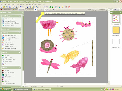
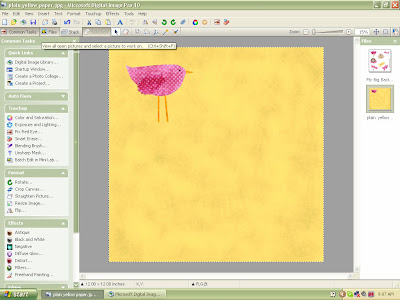
5. You click on this tool and then click or draw around the element freehand style.
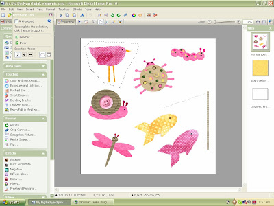
6. I then go to the copy button and hit copy (you can also use the cut and paste, but I always worry about accidentally saving without the element there...so I use the copy and paste).


7. Then select in your files open (to the left), the paper you are pasting on. Hit the paste button.

8. And there you have it: a bird nicely pasted on the paper. You can then go in and add the drop shadow if you want and complete your layout.

June 12, 2008

Using Templates

As promised, I had many ask on how to use templates. I save all my templates that I offer in png, so that they are easy to fill and replace. I will show you how and then you can go get my free templates and try one on your own. Also, if you want the kit I used it is called Bubblegum Garden. By the way, this will only work if the template elements are not flattened down and if they are saved in png format (like mine) but there are others out there that do it that way too.
.
If you are using PSP or Photoshop, I found a great scrapbooking site (Scrapbook-Elements) that shares wonderful tutorials as well, go here for PSP: http://www.scrapbook-elements.com/tutorials/SBE_Using-Layered-Templates-in-PaintShopPro12.pdf and if you have Photoshop: http://www.scrapbook-elements.com/tutorials/SBE_Using-PSD-Layered-Templates-in-Photoshop.pdf. Good luck and continue on if you use DIP.
.
1. First go to your library and select the template you want to use and then all the paper. Bring it up so that it is on your screen.

2. Now using your mouse, select the background 12x12 box (white). Then go to your toolbar and bring down the menu under "Effects". Select "Fill with texture or color".
3. When it opens click on the button that says "Picture".
4. This is the place where it allows you to select the picture you want to fill that shape with. Go over into your opened files (yellow arrow) and select the paper you want. It will automatically fill this shape for you. Select done and continue these steps with all the shapes you want to fill on your page. You can take off what you don't want to use, move shapes around and make them bigger or smaller. I have filled all the shapes and have also opened the elements I want to use and placed them on the layout as well. Now I am ready to put in the photos.
5. Go into your library and select the photos you want to use. For this template it has five, but again, feel free to make it your own. When your photos are in your file palette, go through the same steps above that you used to fill in the paper. You can move them around and make them bigger or smaller before you hit the "Done" button. Don't forget to add drop shadows (if desired), journaling, and other elements.
Here is my completed layout page...it took about 15 minutes. This is such a useful technique and one I promise, you will use over and over for a number of reasons. For example, often times I purchase a kit and I want the element or the alphabet a different color than what was provided. You can change it! So have fun, play around with this and enjoy!


April 11, 2008

Changing Elements Black to White and Color

1. Many of the kits come with black elements, like this flourish frame. I want to use it, but don't like the black, so it is on my paper and I select it to work on.
2. On the left tool bar under effects, select the negative button. It goes white. (This also works the opposite way as well from white to black.)
3. I want to change the color now. So go to color and saturation.
4. I saturate the white till it is a pale yellow, which is an easier palette color to work with.
5. Now got to the top tool bar and select under effects the change hue tool.
6. Move the ball around till you get the saturation and hue you want.
7. Now let's say I don't really like the yellow after all and want to try a different color. Just go to Edit and hit undo (this also works if you accidentally move a paper around or mess something up while you are working on it (just don't hit save!).
8. I went through the process again with the change hue to get this blue frame.


March 30, 2008

Layering

I picked a very simple layout to show you how you work in layers when making your page. To begin with I select from the Digital Library all the elements, paper and photos I want to work with and bring them to my work space. I try to scrap in the layers in order...for example, I pick the paper and then put the photo down and then lay the element on top...however at times, you change your mind, or need to put something behind another object. I use the layering tool ALL the time! So here you go a run down of what to do.

1. I have picked the paper and then I have placed the picture and ribbons underneath. Then I decided I wanted to put another layer of paper underneath the photo as a frame.
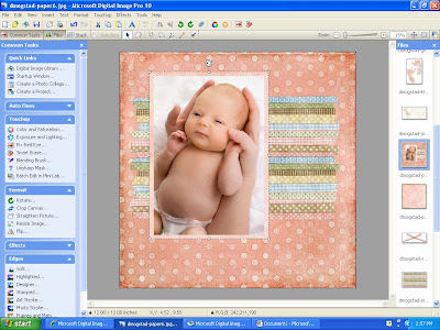
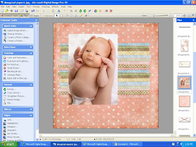
2. I selected another paper from my open files on the far right side column. I then used my marquee tool in the tool bar where the arrow is pointing to below. I drag it onto my paper to form a shape (in this case a square) and then hit copy. Make sure you go back up to the same tool bar and hit the arrow or grab tool again (up by the marquee tool). Go to your open files list and select your layout page and hit the paste button.
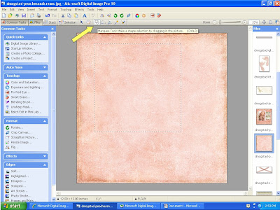
3. Now you have your selected paper pasted on top of your photo and you need it underneath. 
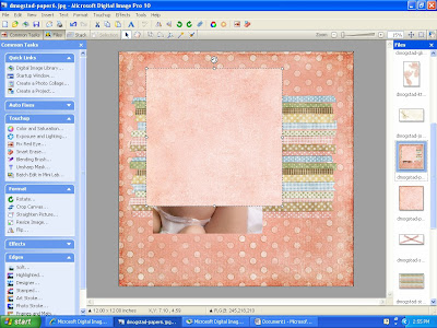
4. I always work from the top, so whatever layer I want on top I select it (in this example the photo). I then left click and move the cursor down to the "move forward or backwards" action. Select bring forward. 
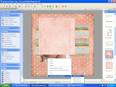
5. Now your photo is in front where it should be. You can then select the border paper and pull it till it fits around your photo the way you want.
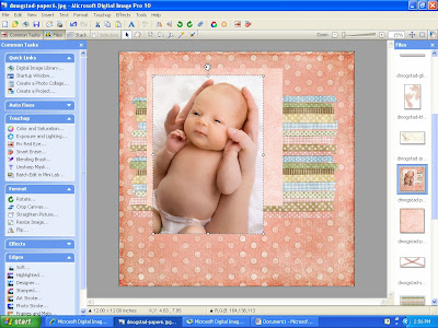
6. To finish it I added a tag, some wording and then went through the same layering process to get the footprints behind the lettering by placing them on and bringing the words to the front. And we are done! If you have any questions or comments - please email or post and I will answer as soon as I can. Have fun!
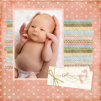
This adorable kit has many lullaby and sweet bedtime features. You can purchase it from Sweet Shoppe and it is called, The Land of Nod by Dani Mogstad.

Adding Shadows

Once in a while I like to add shadows to some of the elements or embellishments on my pages. It helps them stand out and creates a "realness" to the page. So, I showed you how to do this easy trick with our little cupcake here. I layered it on the page and then selected the heart to add a shadow to.
1. Go to the effects tab on the top tool bar and select shadow.
3. You can experiment with all the different types of shadows, I selected the soft one. (It is also my favorite and the one I use often). After you select the shadow you want you can then go into the customize settings (icon with the pencils).


4. The transparency slider increases how dark or light the shadow is and the edge softness smudges the edge of the shadow. You can also change the color of the shadow if you want.


5. The finished product. The heart has a light shadow under it to create a little depth between the layers on the cupcake. If you look at many of our layout examples, we do this frequently to small elements and frames to give it dimension.

Changing Color/Hue

1. Open up a paper that you want to use from one of your kits. Then go to effects in the top tool bar and in the drop down menu select "change hue".


2. Change the hue by dragging the yellow circle around the outer ring. Change the saturation by dragging the blue circle toward the inside ring and increase brightness by dragging blue circle to the outside of the inner ring. If you are happy with the results then you are done and can begin scrapping, if not continue below.


3. Go into your touch-up section on the left and click on color and saturation. Play around with the midtone saturations and the lighting till you get the color you are looking for.

The great thing about knowing how to do this is it saves money, you can continue using paper and embellishments without getting bored. Also, sometimes the color supplied doesn't quite match the photo, so you can "tweak" it a bit to get the right look and color. Don't be afraid to experiment and play around...just remember not to hit the save button!

March 19, 2008

Color and Saturation Tool


I loved this picture of my daughter in the early evening hours looking at these pretty orange flowers. The light was not great and I was disappointed with the picture when I got it onto my editor…it didn’t capture the colors at all! So, I opened my color and saturation tool and went to work. (1) I changed saturation and color levels to make it look a little more “sunny” or look like the gold tones from natural sunlight were there, even though they weren’t. (2) You can also play around with the actual color levels of the picture. For instance if you have a picture of the sky you can increase the blue to really make it stand out. Again – PRACTICE makes perfect!


Exposure and Lighting Tool


Unless you have an awesome camera or are a great photographer (I am not) then often times you will import your pictures from your camera looking like this first one of my cat. You can fix that though by opening the Exposure and Lighting Tool found on the left of the screen. Don’t be afraid to go in and do this manually. The more you practice, the better you’ll get. Can you see the difference in the two pictures? (You may have to click on them to get up close). I just played around with the midtones and highlights features till I got it lighter and looking the way I wanted. After I finish here, I usually go to the Color and Saturation tool and fix the color also. It is pretty amazing the fun things you can do with these two tools. Just get on and get to know your program; I recommend this before really getting into the digital scrapping…though doing that will help you get better too. Have fun with it and don’t get discouraged!
.
Shadow: The amount of shadow in a picture (less for a darker finish, increase for brighter – like a flash)

Midtones: Increase/Decrease to affect the amount of light in the picture.

Highlights: Increasing really brightens the white balance and can help make colors pop.

Contrast: Use this to increase/decrease the contrast between light and dark.
To view the screenshot up close, just click on it...