
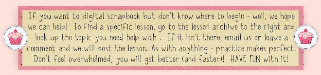
I picked a very simple layout to show you how you work in layers when making your page. To begin with I select from the Digital Library all the elements, paper and photos I want to work with and bring them to my work space. I try to scrap in the layers in order...for example, I pick the paper and then put the photo down and then lay the element on top...however at times, you change your mind, or need to put something behind another object. I use the layering tool ALL the time! So here you go a run down of what to do.
1. I have picked the paper and then I have placed the picture and ribbons underneath. Then I decided I wanted to put another layer of paper underneath the photo as a frame.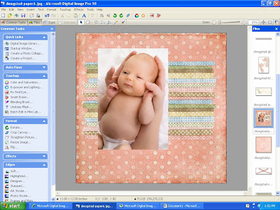 2. I selected another paper from my open files on the far right side column. I then used my marquee tool in the tool bar where the arrow is pointing to below. I drag it onto my paper to form a shape (in this case a square) and then hit copy. Make sure you go back up to the same tool bar and hit the arrow or grab tool again (up by the marquee tool). Go to your open files list and select your layout page and hit the paste button.
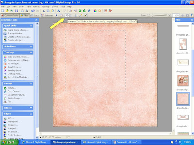 3. Now you have your selected paper pasted on top of your photo and you need it underneath.
  4. I always work from the top, so whatever layer I want on top I select it (in this example the photo). I then left click and move the cursor down to the "move forward or backwards" action. Select bring forward.
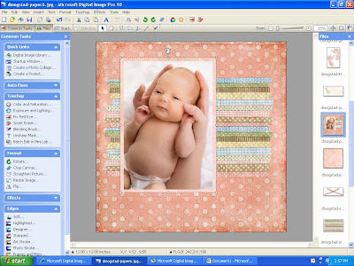
 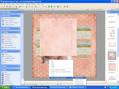 5. Now your photo is in front where it should be. You can then select the border paper and pull it till it fits around your photo the way you want.
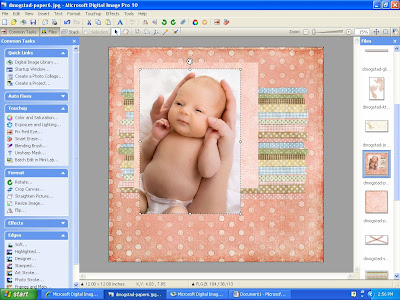
 6. To finish it I added a tag, some wording and then went through the same layering process to get the footprints behind the lettering by placing them on and bringing the words to the front. And we are done! If you have any questions or comments - please email or post and I will answer as soon as I can. Have fun!
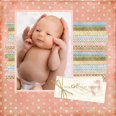
This adorable kit has many lullaby and sweet bedtime features. You can purchase it from Sweet Shoppe and it is called, The Land of Nod by Dani Mogstad.
2. I selected another paper from my open files on the far right side column. I then used my marquee tool in the tool bar where the arrow is pointing to below. I drag it onto my paper to form a shape (in this case a square) and then hit copy. Make sure you go back up to the same tool bar and hit the arrow or grab tool again (up by the marquee tool). Go to your open files list and select your layout page and hit the paste button.3. Now you have your selected paper pasted on top of your photo and you need it underneath. 4. I always work from the top, so whatever layer I want on top I select it (in this example the photo). I then left click and move the cursor down to the "move forward or backwards" action. Select bring forward. 5. Now your photo is in front where it should be. You can then select the border paper and pull it till it fits around your photo the way you want.6. To finish it I added a tag, some wording and then went through the same layering process to get the footprints behind the lettering by placing them on and bringing the words to the front. And we are done! If you have any questions or comments - please email or post and I will answer as soon as I can. Have fun!


